 guy
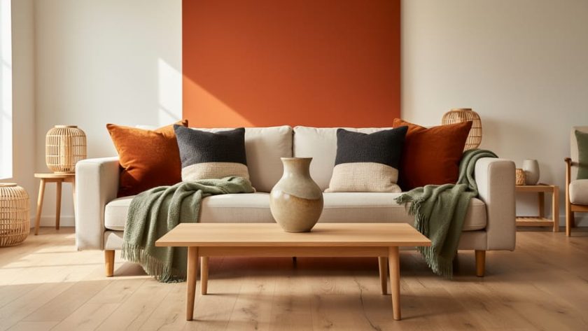
guy Burnt orange brings instant warmth and sophistication to any room, and you can incorporate it successfully through throw pillows, accent walls, or statement furniture pieces paired with neutrals like cream, charcoal, or sage green. This rich, earthy shade has become one of the most versatile colors in contemporary modern decor ideas working equally well in minimalist spaces and maximalist designs.
What makes burnt orange particularly appealing is its ability to anchor a room without overwhelming it. Unlike brighter oranges that can feel cartoonish or dated, this deeper hue offers the visual weight of a neutral while adding genuine personality. It pairs beautifully with natural materials like wood, rattan, and linen, making it perfect for anyone looking to create a grounded, organic aesthetic.
The challenge most people face isn’t whether to use burnt orange, but how much to use and where to place it. Too little and it gets lost. Too much and your space can feel one-note or visually heavy. The sweet spot depends on your room’s natural light, existing color palette, and the mood you want to create.
This guide will show you exactly how to use burnt orange in every room of your home, which complementary colors create the most striking combinations, and which budget-friendly pieces deliver the biggest visual impact. You’ll also learn the most common mistakes that make this color fall flat and how to avoid them entirely.
Why Burnt Orange Is Having a Moment Right Now
Burnt orange has emerged as the refined answer to homeowners craving warmth without the intensity of brighter orange shades. While orange home decor surged in popularity throughout the mid-2020s, burnt orange specifically has captured attention in 2026 because it delivers richness without demanding to be the room’s loudest element.
The shift reflects a broader move toward comfort-focused interiors that prioritize feeling over flash. After years of cool grays and stark minimalism, homeowners are gravitating toward colors that make spaces feel lived-in and inviting. Burnt orange sits perfectly in this sweet spot, offering visual warmth that reads as sophisticated rather than playful.
Nature-inspired palettes have driven much of this shift. Burnt orange mirrors the tones found in desert landscapes, autumn foliage, and terracotta clay. These connections to the natural world make it feel grounding in ways that synthetic or neon colors simply can’t match. It’s a shade that people instinctively respond to as calming rather than energizing.
What sets burnt orange apart from its brighter orange cousins is its versatility with existing decor. It plays well with both warm wood tones and cooler metals, works alongside neutrals without disappearing, and complements other earth tones without creating a muddy palette. You get the impact of color without boxing yourself into a specific design direction.
The color also benefits from its association with quality materials. Burnt orange evokes leather, aged copper, and natural dyes rather than plastic or synthetic finishes. This perception makes it feel more elevated and permanent, which matters when homeowners are choosing colors they’ll live with beyond a single season.
Best Rooms for Burnt Orange Accents
Living Rooms and Social Spaces
Living rooms are ideal for burnt orange because the color adds instant warmth without requiring a complete redesign. Start with throw pillows in varying textures, velvet, linen, or wool, clustered on a neutral sofa. Mix solid burnt orange with patterned options that incorporate the shade alongside cream or sage green for visual interest without monotony.
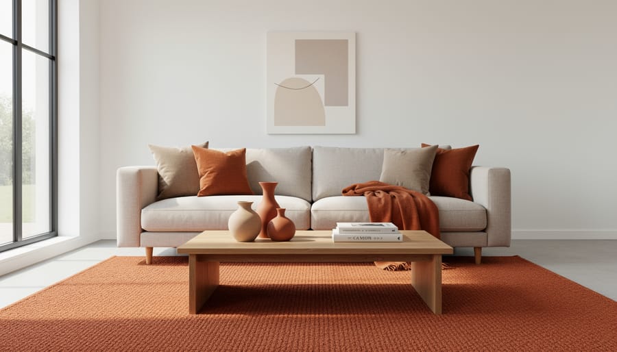
Area rugs anchor the space and define conversation areas. A burnt orange rug works beautifully under a coffee table or beneath a seating arrangement, especially in rooms with cool-toned flooring. Look for geometric or abstract patterns that incorporate burnt orange as one of several colors rather than solid pieces, which can feel overwhelming in larger formats.
Curtains in burnt orange introduce the color at eye level while controlling how much appears based on whether they’re open or closed. Pair them with neutral walls to let the window treatments stand out, or use sheer burnt orange panels over white sheers for adjustable warmth.
For confident decorators, an accent wall in burnt orange creates a focal point behind a sofa or fireplace. Balance it with plenty of neutral furniture and limit additional burnt orange accents in the same space. The wall should be the statement, not compete with equally bold accessories.
Bedrooms for Cozy Retreats
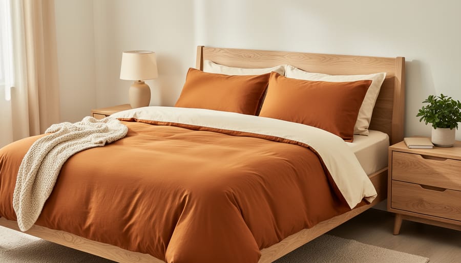
Burnt orange bedding transforms a bedroom into a warm cocoon without the aggressive energy of brighter oranges. Start with duvet covers or quilts in burnt orange paired with cream, oatmeal, or soft gray sheets, the contrast creates depth while keeping the space restful. If a full burnt orange bed feels too bold, try layering: white or beige bedding with a burnt orange throw blanket folded at the foot, plus two or three matching accent pillows.
An upholstered headboard in burnt orange velvet or linen makes a sophisticated focal point that doesn’t overwhelm because it sits behind you while you sleep. Pair it with neutral walls and complementary bedroom flooring in natural wood tones or soft carpet.
Keep burnt orange accents to 20-30% of the room’s visual weight. Balance the warmth with plenty of neutrals through white nightstands, beige area rugs, or light curtains. Table lamps with burnt orange ceramic bases or rust-colored lampshades add ambient warmth without competing with bedding. A single piece of burnt orange artwork above the headboard ties everything together while maintaining the calm atmosphere bedrooms need.
Kitchens and Dining Areas
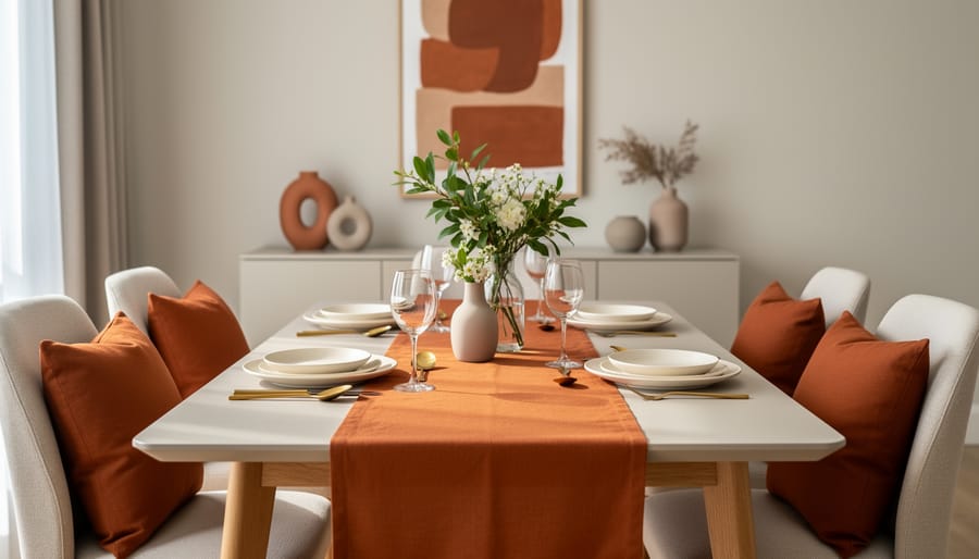
Kitchens and dining areas offer surprisingly versatile opportunities for burnt orange, especially since the color naturally complements food and creates an appetizing atmosphere. Start with dishware, burnt orange dinner plates, serving bowls, or coffee mugs add warmth to open shelving or glass-front cabinets without permanent commitment. If you’re renovating, consider burnt orange bar stools or counter-height chairs, which work beautifully against white, gray, or natural wood cabinetry.
Small appliances like stand mixers, toasters, or tea kettles in burnt orange create instant focal points on countertops, though this works best if you have neutral backsplashes and aren’t fighting multiple competing colors. For a bolder move, burnt orange subway tiles or mosaic backsplashes can anchor your entire kitchen palette, but evaluate your existing cabinet undertones first, warm wood tones pair effortlessly, while cool-toned grays may clash. Check out these kitchen cabinet tips before making permanent color decisions that need to coordinate with your cabinetry.
In dining spaces, burnt orange table runners, placemats, or upholstered dining chairs introduce the shade without overwhelming the room. The key is balancing burnt orange against your dominant kitchen colors rather than forcing it into a space where it fights for attention.
Entryways and Hallways
Entryways and hallways are often overlooked, but they’re your chance to make guests feel welcome before they even reach your main living spaces. A burnt orange runner instantly warms up a narrow hallway while guiding the eye forward. Look for durable, low-pile options that can handle foot traffic without showing wear quickly.
Console tables become natural focal points when you style them with burnt orange accents. Try a ceramic vase, a stack of burnt orange books, or a small table lamp with a warm-toned shade. Keep it simple, three to five pieces maximum, so the space doesn’t feel cluttered in what’s already a tight area.
Artwork gives you the most flexibility here. A single large piece with burnt orange as the dominant color creates impact without eating up floor space. Abstract prints work especially well in transitional areas where you don’t need literal subject matter.
If you have room, swap out a bland bench for one with burnt orange upholstery or add a narrow accent chair. These pieces serve double duty as functional seating and color statements, making your entryway feel intentional rather than like an afterthought.
Color Combinations That Make Burnt Orange Shine
Burnt orange plays well with other colors because it sits right in the sweet spot between warm and earthy, bold enough to make a statement but grounded enough not to fight for attention. The key is understanding which pairings create the mood you’re after.
Neutrals: The Safe Foundation
Pairing burnt orange with cream, beige, or taupe is the easiest way to let the color shine without overwhelming a space. These soft neutrals act as a canvas, allowing burnt orange to be the focal point while keeping the overall feel balanced and sophisticated. Think a burnt orange velvet sofa against creamy walls, or terracotta-toned throw pillows on a beige linen sectional. Taupe works especially well because it has those same warm undertones that harmonize naturally with burnt orange’s earthy base. This combination works in nearly any room and feels timeless rather than trendy.
Cool Tones: Drama and Depth
Here’s where color theory gets interesting. Burnt orange sits opposite blue-green tones on the color wheel, which means pairing it with navy, teal, or sage green creates what designers call complementary contrast, colors that make each other pop. A burnt orange accent chair in a navy-walled study feels intentional and striking. Teal and burnt orange together channel a retro vibe that’s having a resurgence in 2026, perfect for kitchens or dining rooms. Sage green offers a softer, more organic pairing that works beautifully in bedrooms and living spaces where you want warmth without intensity.
| Color Pairing | Mood Created | Best Room Application |
|---|---|---|
| Burnt Orange + Cream | Warm, Inviting, Classic | Living rooms, bedrooms |
| Burnt Orange + Navy | Bold, Sophisticated, Grounded | Home offices, dining rooms |
| Burnt Orange + Sage Green | Natural, Calming, Organic | Bedrooms, bathrooms |
| Burnt Orange + Mustard | Cheerful, Energetic, Retro | Kitchens, entryways |
Warm Companions: Layered Richness
Combining burnt orange with mustard yellow or terracotta creates a layered, tonal look that feels curated rather than matchy. These colors share similar warmth but differ enough in intensity to add visual interest. A mustard throw blanket draped over a burnt orange chair, or terracotta pots grouped with burnt orange cushions on a patio, builds depth without clashing. This approach works best when you vary the saturation, pair a muted burnt orange with a brighter mustard, or vice versa, so they don’t blend into one indistinct blob of color.
The real trick isn’t memorizing rules. It’s testing combinations in your actual space with its specific lighting, seeing what makes you feel good when you walk in the room.
Start Small: Easy Burnt Orange Accents for Beginners
Testing burnt orange doesn’t require a complete room makeover. Start with portable pieces you can move around until you find what works.
Throw pillows remain the easiest entry point. Look for covers in velvet or linen fabrics, they add texture while letting you swap them seasonally. A single 20×20 pillow on a neutral sofa introduces the color without commitment. You can find quality options at home goods stores, though it’s worth checking multiple retailers to compare fabric weight and zipper quality before buying.
Blankets offer similar flexibility with more visual impact. A chunky knit throw in burnt orange draped over your couch or folded at the foot of your bed adds warmth instantly. Cotton waffle weaves work well in warmer months, while heavier wool blends suit fall and winter. The beauty of blankets? They’re functional, not just decorative.
Vases bridge the gap between decor and practical use. A ceramic vase in burnt orange becomes a focal point when filled with greenery or dried grasses. Look for pieces with interesting shapes, a rounded terracotta-style base or a tall cylindrical form creates visual interest even when empty. Cluster smaller vases together on a coffee table or mantel for more presence.
Artwork provides color at eye level where it makes the biggest impact. Abstract prints with burnt orange as the dominant shade work in most rooms, or consider photography featuring desert landscapes or autumn scenes. If you’re looking to refresh on a budget frame fabric swatches or pages from design magazines in burnt orange tones.
Candles in burnt orange vessels add ambiance while serving double duty as decor. Pillar candles in glass holders or ceramic containers contribute color even when unlit. Soy candles in amber or terracotta jars work particularly well on bookshelves and side tables.
Start with one or two of these accents in a single room, then expand as you gain confidence with the color.
Statement Pieces Worth the Investment
A burnt orange sofa or accent chair can anchor a room’s entire color story, but these investments require more thought than a throw pillow. The key question is whether you’re committed to this shade long enough to justify the cost. If you’ve already experimented with smaller burnt orange accents and consistently love them, a larger piece makes sense.
Look for quality construction first. A well-made burnt orange velvet chair or linen sofa will outlast trend cycles because the craftsmanship itself has value. Check for hardwood frames, eight-way hand-tied springs, and tightly woven upholstery. When you’re at a retailer, sit in the piece hard, bounce a little, and check seams. Quality furniture shouldn’t creak or show stress points immediately.
- Creates an instant focal point that defines the room’s aesthetic.
- Higher-quality pieces remain functional and beautiful for years beyond trend cycles.
- Easier to build a cohesive color scheme around one statement piece than multiple small items.
- Significant upfront cost compared to testing the color with accessories.
- Harder to move or sell if your taste changes or you relocate.
- Limits flexibility to shift color palettes seasonally or quickly.
Area rugs offer a middle ground between small accents and major furniture. A burnt orange rug grounds a seating area while remaining easier to replace than a sofa. Choose wool or wool-blend rugs rather than synthetic materials. They wear better, resist staining, and the color ages more gracefully.
For curtains, consider lined panels in burnt orange linen or cotton. Blackout lining extends their lifespan and prevents fading from sunlight. Measure twice before ordering. Custom curtains cost more upfront but fit properly, which makes them look more expensive and intentional.
The IKEA Style Guide launching January 21, 2026 typically showcases affordable versions of trending pieces if you want to see how burnt orange looks in complete room settings before committing. For higher-end options, the Design Home Spring Market (April 13-15, 2026, at 7580 Bath Rd, Mississauga, ON) brings together furniture vendors where you can compare construction and fabrics in person.
Buy what you genuinely love, not what feels trendy right now. A burnt orange piece you’re excited to see every day will outlast any color cycle.
DIY Ideas to Add Burnt Orange Without Buying New
Transforming what you already own into burnt orange decor is easier than you think, and it costs far less than buying new pieces. These projects work for different skill levels, so you can start simple and build your confidence.
Paint Existing Furniture
Give outdated wood furniture new life with burnt orange paint. Side tables, bookshelves, and picture frames are ideal beginner projects that require only sandpaper, primer, and paint. For a modern twist, try painting just the interior of open shelving or the drawer fronts of a dresser while keeping the frame neutral. Chalk paint requires minimal prep work and dries quickly, making it perfect for weekend projects.
Dye Textiles You Already Have
White or cream cotton items like pillowcases, tea towels, and curtain panels can be dyed burnt orange using fabric dye. Follow the package directions carefully, and use a large pot or bucket you don’t mind dedicating to dyeing. This works best on natural fibers. Keep in mind that the original color affects the final result, so test on a hidden corner first if you’re working with anything other than white.
Create Your Own Artwork
Burnt orange abstract art requires no artistic training. Stretch a canvas over a frame or use thick watercolor paper, then apply burnt orange paint in geometric shapes, broad brushstrokes, or even splatters mixed with cream and navy. You’ll have custom art that perfectly matches your color scheme for the cost of basic craft supplies.
Refinish Thrifted Finds
Scout thrift stores for solid wood items with good bones but dated finishes. Strip the old varnish, sand smooth, and apply burnt orange stain or paint. Wooden trays, mirrors with ornate frames, and small accent tables are frequently available and transform beautifully with minimal effort.
Common Mistakes to Avoid with Burnt Orange Decor
The biggest mistake people make with burnt orange is treating it like a neutral and using it everywhere. One burnt orange throw pillow creates warmth; a burnt orange sofa, rug, curtains, and wall art in the same room creates visual overload. Your eye needs places to rest. Limit burnt orange to 20-30% of a room’s color palette, with neutrals and complementary shades filling the rest.
Clashing undertones is another common trap. Burnt orange has warm, earthy undertones, so it fights against cool grays with blue or purple bases. If your walls are a cool-toned gray and you add burnt orange accents, the colors will feel uncomfortable together rather than cohesive. Check your existing paint and furniture undertones before committing. Warm grays with beige or greige bases play nicely with burnt orange, while stark cool grays don’t.
Lighting conditions make or break burnt orange decor. In north-facing rooms with limited natural light, burnt orange can read muddy or brownish instead of vibrant and warm. Test samples in your actual space throughout the day before buying larger pieces. South-facing rooms with abundant sunlight showcase burnt orange beautifully, while rooms with warm artificial lighting enhance its cozy qualities.
Choosing the wrong shade intensity for your space creates problems too. Deep, saturated burnt orange works in large rooms with high ceilings but overwhelms small spaces like powder rooms or narrow hallways. Lighter terracotta or peachy burnt orange tones suit compact areas better.
The fix for most burnt orange mistakes is simple: remove some of it. Swap out one or two pieces for neutrals, adjust your lighting with warmer bulbs, or replace a dark burnt orange item with a lighter version. You can always add more later, but starting with less prevents costly overcorrection.
Where to Shop for Burnt Orange Decor in 2026
Finding burnt orange decor in 2026 is easier than you might think, with options ranging from major retailers to specialty events. The key is knowing where to look and timing your shopping around new releases and seasonal showcases.
IKEA released its 2026 Style Guide on January 21, 2026, featuring 4 new design styles, 2 macro trends, and their color of the year. This guide is worth checking because IKEA typically interprets warm, earthy tones in accessible ways that work for renters and homeowners alike. You’ll find their collections hit the sweet spot between trendy and affordable, making it a solid starting point for larger items like textiles and storage solutions.
For hands-on shopping experiences, mark these dates in your calendar:
| Event/Release | Date | Location | Best For |
|---|---|---|---|
| IKEA 2026 Style Guide | January 21, 2026 | Online & in-store | Textiles, pillows, storage |
| Design Home Spring Market | April 13-15, 2026 | 7580 Bath Rd, Mississauga, ON | Statement pieces, artisan finds |
| Canada’s Home & Gift Showrooms | August 6-13, 2026(6-7: 9AM-5PM) | Check event listings | Seasonal decor, unique accents |
Online retailers like West Elm, CB2, and Wayfair consistently carry burnt orange options, especially during fall. Target and H&M Home rotate trendy colors seasonally, so check their new arrivals regularly. Etsy remains excellent for handmade items like macrame wall hangings, ceramic vases, and custom throw pillows in exact shades you’re after.
When shopping in person, bring paint swatches or photos of your existing room. Burnt orange varies wildly under different lighting conditions, and what looks perfect in the store might read too red or too brown at home. Request free decor catalogs from retailers to browse shade variations before committing to larger purchases.
Thrift stores and estate sales are goldmines for vintage burnt orange pieces, particularly ceramic lamps, woven baskets, and retro artwork that’s cycling back into style. You’re basically shopping someone else’s 1970s collection, which means authentic pieces at a fraction of new retail costs.
You’ve seen how burnt orange can transform spaces without taking over completely. That’s its real strength, warmth and sophistication that works whether you’re riding the current wave of orange home decor or looking for something with genuine staying power.
Start with one or two pieces that genuinely excite you. A throw pillow you’ll actually use. An accent chair you’ve been eyeing. A rug that anchors your space exactly how you want it. See how that burnt orange plays with your existing colors and lighting before committing to bigger changes.
The best part? Burnt orange bridges trend and timeless beautifully. It’s having a moment right now, yes, but it’s also rooted in those warm, earthy tones people have loved for generations. You’re not decorating for a season, you’re creating a space that feels welcoming today and will still look intentional years from now.
Trust your instincts. If a burnt orange piece makes your room feel more like home, that’s all the permission you need.